Talis Aspire Reading Lists Improvements: Navigation Bar

We are continually working on Talis Aspire Reading Lists to improve accessibility and ensure the best possible experience for library staff, academics, and students. After listening to your feedback and making some key changes, we’d like to show an update to the navigation bar we’ve been working on:

User controls have moved into the main navigation bar, and, where the option exists, so has the ability to switch language. The drop-down menus themselves now have a consistent look and feel across Talis.
We are doing this in order to:
- Improve accessibility
- We can now implement standards which will benefit those of your users who require assistive technologies, such as screen-readers.
- Students and academics can navigate across the top-level links, and down into sub-menus via the keyboard.
- Set the foundations for a fluid navigation menu
- The changes allow the implementation of a menu that will look good and function well on smaller screens. It’s the first of many such moves that mean students and academics can use Talis Aspire Reading Lists across a number of devices.
- Apply consistency across Talis products
- The appearance and style of the menu will become standardised across our products making it easier to move from one to the other.
These all add up to an improved experience for you, your colleagues, and your students.
We’d like to offer a two week preview from Monday, 18th of January, with a deadline for feedback on 1st of February. During this fortnight, we’ll make the update available on https://preview.rl.talis.com, where you will be able to review how the new navigation complements your branding prior to release. If you don’t know your shortcode in order to view the changes, please raise a support request so we can advise you.
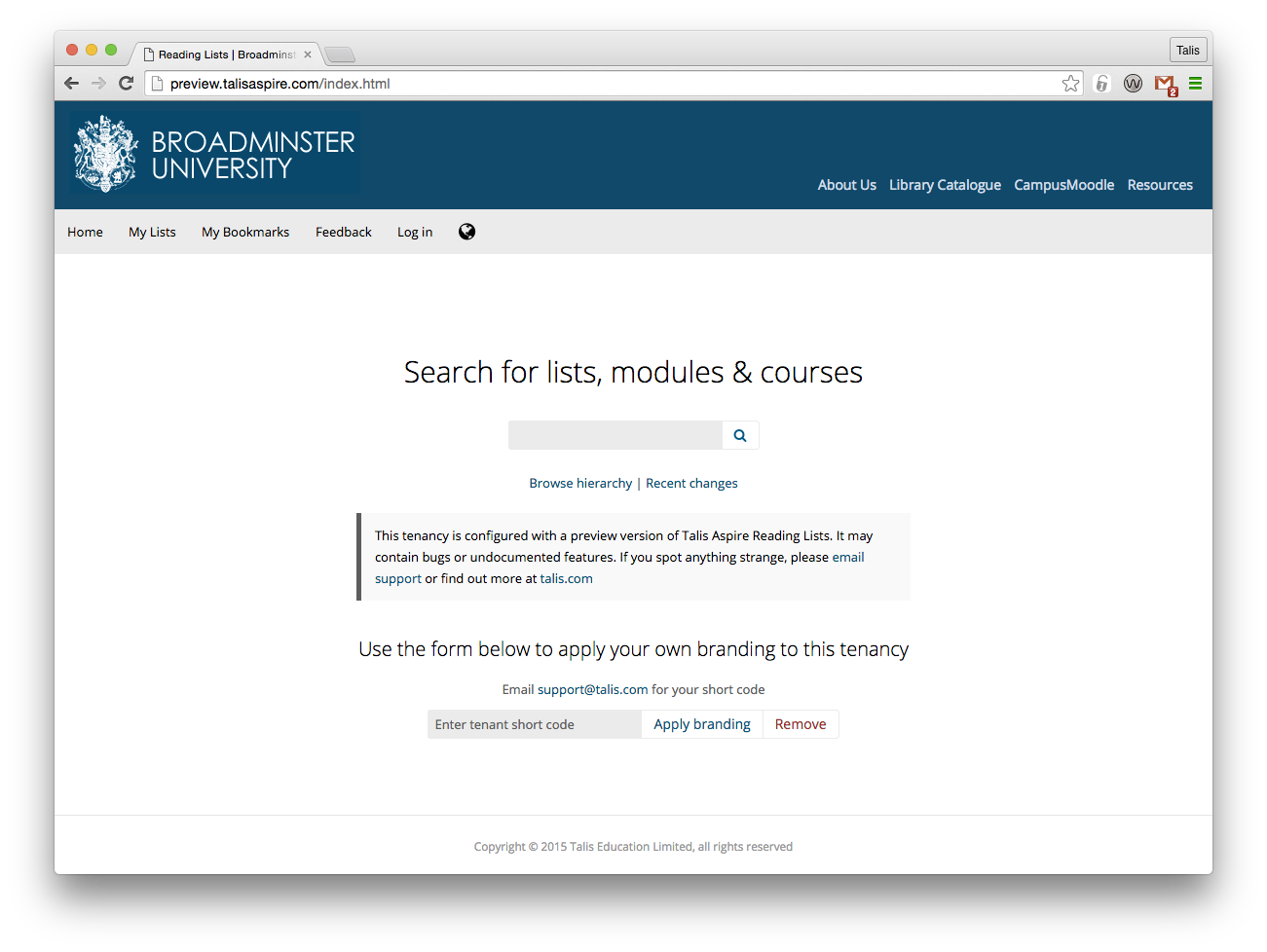
For the purposes of this preview, we take the existing background colour of your old navigation, and determine a suitable text colour based on contrast. If the background colour cannot be sourced, it will appear in a neutral shade of grey, as illustrated below:
This suits the vast majority of cases, but if you wish to make adjustments to the background or text colours, please raise a support request, and we can apply them to your tenancy ahead of the release. We’ll help ensure that guidelines for colour contrast are followed.
If you have any questions about these changes, please raise a support request.

